Terry's GIS Blog

Terry's GIS Studies and Transition to a New Career

Sunday, June 21, 2020

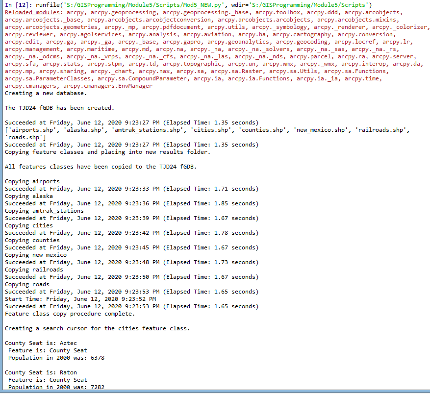
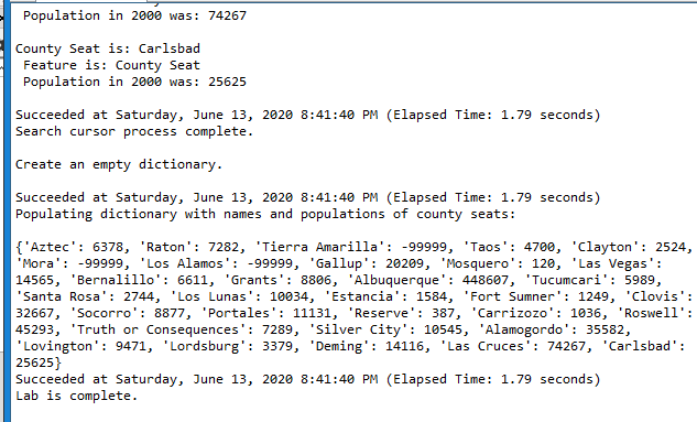
Module 6--Working with Geometries

Because of COVID, we were only required to do the last two modules. I completed M7 first, because it seemed easier.

In this module, I had to work with nested loops, search cursors, For Loops, and writing to text files for a system of rivers in Hawaii. The lab was very confusing and you definitely needed to use a pseudocode and to break up the lab into small parts. However, the exercise provided a base of knowledge from which to build upon.

Below are the results of the text file, which returned the Feature ID, Vertex ID, X and Y Coordinate, and the name of the feature:
Screenshot Showing OID, Vertex, X/Y Coordinates, and Name


Below is the pseudocode:


Start
               Import arcpy
               Import env from arcpy
               overwrite output = true
               workspace = “S:\GISProgramming\Module6\Data”
    new text file = “rivers_TJD.txt” (use the write function, “w”)
    fc = “rivers.shp”
               cursor = arcpy.da.SearchCursor(fc, [OID@, SHAPE@, NAME])
               use for loop through the cursor for each point
               vertex = 0
               vertex += 1
               f.write the results to the text file
               print results
               close text file
               delete row
               delete cursor
               print statement: The lab is complete
End


As always, take it one step at a time and look closely at indents, spaces, and other small issues to prevent syntax errors. Ensure you enable the overwrite function so you do not get the error code if you have to start another portion of the script again. Remember to think of the information you write as a table of columns and rows. Of course, the columns are the headers, OID, Vertex, X Coord, Y Coord, Name, etc. The rows are the actual features. Therefore, when you iterate over the loop, you are using {} to identify each column (e.g., {0} will be OID, {1} will be vertex, etc.).

Thursday, June 18, 2020

Module 7--Rasters

Because of the shortened semester, we were allowed to choose between Module 6 and Module 7. I chose Module 7, which spoke about using rasters. In this module, I learned to import specific spatial analysis tools, ensure spatial analysis licensing was active, and create a raster map.

The module began with importing the typical modules and classes and setting the workspace environment. I then wrote a conditional statement (if/else) that would let me know if  the spatial analysis extension was available. After I checked out the SA extension, I reclassified the landcover map to only show forested land, input elevation, slope, and aspect functions, and then combined the rasters into one raster. Because these are not saved with the program, I added a save statement to ensure the raster was permanent. Because the raster ran, I knew the SA extension was good.

Raster image showing elevation, slope, and aspect for forest landcover

Friday, June 12, 2020

Module 5--Exploring and Manipulating Data

Well, I can guarantee that I am not quitting my day job. Though the lab started out easily, I got hung up on populating the dictionary. I probably spent 16 hours or more just one that one small step. After I finally figured out the issue, which was that by adding the update, get value statement for keys and values, and the key:value format statement within the for loop, everything printed out as required. I figured this out by commenting out lines of code and then adding new lines to see what happened. I eventually worked through the issues. Of course, viewing the student questions site on Canvas also assisted. Believe me, I contributed to the questions, but I also shared my solution.

The lab worked sequentially and built upon each step. Beginning with creating a new file geodatabase, I then assigned my feature classes to "fclist." I then copied these FCs to the new fGDB using a "for loop" (and also stripped out the .shp extension). Between each step, I learned how to add statements showing the date, time, and the amount of time the computer needed to complete the step. I also used "\n" to make sure lines were skipped for ease of viewing.

This screenshot shows the first several steps of the lab, to include the commentary: Create fGDB, copy Feature Classes, and creating a search cursor that returns county seats. The list of county seats is truncated to save space, but the code shows the information for all the county seats.
I then used a search cursor to sort out all the cities that were considered county seats in the feature column of the table. The only information I needed for this exercise was the name of the city, the feature, and the 2000 population.
Screenshot of the end of the county seat information. The dictionary is populated in the correct format {key:value}. Statements say how long it took, when the process finished, and the lab was complete.

Once I got the dictionary to print, the lab was complete. Though the lab was a challenge, I learned a lot.

A few words of advice:
--delete the row and cursor once you complete a loop.
--use \n so there is a line break.
--use print(arpy.GetMessage(count-1)) to get the date/time/process time for each line.
--don't forget the # symbol to add a comment.
--make sure ArcGIS Pro is not running at the same time as Spyder or you will likely get an error message.
--use the overwrite argument to reduce the amount of errors you receive saying that the fGDB exists (env.overwriteOutput=True).
--comment out lines of code (sometimes I put different numbers of # marks to keep myself straight) and try new lines. This way, you don't make a change and forget how to reverse it.


Friday, June 5, 2020

Module 4--Geoprocessing

During Module 4, I learned several tools to conduct geoprocessing functions using Python and Spyder. This was a much more enjoyable module because it allowed me to actually perform mapping functions. In other words, I saw the reason why we learn Python.

Some of the new tools I learned for Python:
--Model Builder, which actually built a model using a click/drag function and then having it perform the function. This is a much more visual method to use the tool.
--Buffering, to include dissolve.
--Clip, selects, erase tools.
--Add XY coordinates to a shapefile.
--Using the GetMessages() function to add commentary about the function performed.
--Make a toolbox.

Again, a few points to remember:
--Be very cautious of spelling (module, especially).
--Ensure capitalization is consistent with syntax.
--Consistency with quotation marks and contractions.
--Ensure URL of environment is accurate (spelling, slashes, etc.).
--Ensure comments section at top is complete (name, date, etc) using the # symbol.

Feedback of Hospital Script: Add XY Coordinates, Buffer,m Buffer Dissolve
The above screenshot displayed the results of the script written to add XY coordinates to the hospital shapefile, add a buffer, and then diffuse that buffer to a single feature. To complete this assignment, I broke the script into three parts, where I tested each script to ensure it worked properly before going to the next script. I also commented out commentary to explain what each step would perform. I used the GetMessages function to return the start time, date, etc.. I then added a print statement (separately) to return commentary on what the function performed.

All in all, this was an enjoyable module and a welcome change from the previous modules.


Sunday, May 31, 2020

Module 3: Debugging

This module was much more straightforward than the prior. I am sure part of this is just the extra practice and increased understanding that goes with working through problems. I am glad that this module has been moved to earlier in the class so that we can find our problems in a systematic way.

During this module, we learned several ways to work through exceptions: Visual inspection of syntax, print statements, commenting out a line of code (or lines), and using the debugger tool in Spyder. I used all the tools throughout the exercise and assignment. Besides the visual inspection, I probably commented out several times to work through different versions of the script.

For Part 1, I just had to find two errors in the script. This was very easy, as this was just the warm up for the next two parts. When looking at syntax errors, the key is to consider indenting script properly and consistently, ensuring correct use of upper/lower case, symbols placement ("", :, etc.), and spelling.

Module 3, Part 1, Script 1
The above output was the result of correcting two script errors, which returned the feature classes in a geodatabase. A key to the exercise was ensuring that the scripts provided were in the correct location by verifying in ArcGIS Pro.

For Part 2, there were eight errors. These errors built onto the prior errors, but still contained many syntax errors. There was only one error that was a little difficult to find; however the debugger tool came in handy along with commenting out (using a #) and trying new lines of script. Once the script ran correctly, it printed out the names of the layers in the project's map.

Module 3, Part 2, Script 2

I was a little worried about Part 3 because it was the final step and I knew it would be the culmination of the entire module. For Part 3, we were expected to find an error, which was easy with the debugger tool. We were not supposed to fix the error, but use the try-except statement so that the script would execute with an easy to read statement and then continue to Part B. If correct, Part B would execute without error. The try-except statement was easy; however, it is imperative that you check your indenting so that those actions still remain within the script instead of outside. Below is the flowchart created to assist with this part.


Module 3, Part 3, Script 3
As you can see above, Part A ran, but returned an error statement that I had added to the code with my try-except statement. Once this executed, Part B ran and returned the names of the feature classes, data source, and spatial reference.

All my lessons learned are presented throughout this posting. A lot of this is just attention to detail. A big lesson learned for me was that everyone has errors and that many of the errors are simple spelling or punctuation mistakes. Look at those issues before deep-diving into the actual code. Additionally, the debugger tool is of great assistance.

Monday, May 25, 2020

Module 2: Python Fundamentals

For this week's exercise and assignment, there were numerous operations broken down into four steps. These steps included creating a string variable, creating a list, creating loops and iterating variables, and removing specific variables.

In Step 1, I created a string of my full name,  split the string to separate my individual names, and then used the index function to return a specific name. It is important to note that one uses 0 to return the first name and -1 to return the last portion of a string.

Step 2 required me to determine errors in a random dice game. This required me to first import the random module, which is the first line of code. I then looked at the script provided in the assignment to find two errors. A few things to note in errors: Ensure your quotation marks are not confused with contractions as it will confuse the program and return an error, make sure the case (upper/lower) is consistent, especially when naming a variable, and watch indention.

Step 3 caused me quite a bit of problems, as I overthought everything. In this scenario, I had to create a loop using a while statement and then append numbers to it until I reached 20 separate numbers. Again, this script required me to import the random module as the first step. One lesson I learned is that if you want to break the loop, the break must have the same indention as the loop. Otherwise, Python will return an error. I also learned that there are many different ways to arrive at a break statement.

For Step 4, I used the numbers generated in Step 3 (or I could have added this script to the script in Step 3). I then chose an integer as an unlucky number, used the while loop to remove the unlucky number, and then created a new list. This was fairly straightforward and of no issue. However, the next logical step in the future could be to remove the unlucky number and replace it so that there were still 20 numbers in the list.

Below are the results of my script, which has the return of each script. The explanations are written above, so I will not repeat them.

Script for Module 2. This shows the return items for each step in the assignment as explained above.


Flow Chart for Step 4.


Monday, May 11, 2020

GIS 5103--Programming--Module 1

After what seems like an eternity, classes have started again. This class will teach me how to write script using Python, which is the preferred scripting language for ArcGIS Pro. Though I was introduced to the Integrated Development and Learning Environment (IDLE), this class will use Spyder as the script editor. A word of caution is that if you use a virtual desktop, you must save the your products into the portal. If you were to complete the lab on your personal desktop and then dragged the finished product to the school's portal, there would be errors.

As part of the learning, we were introduced to The Zen of Python, which is a light-hearted set of guidelines for programmers. In a nutshell, the guidelines favor simplicity, utility, and practicality versus nested layers, complexity, etc. These guidelines also ensure Python can remain open source software and that others can add to its body of knowledge. Besides a few inside jokes in Zen, there is another: If you type in "import this" in Spyder, the Zen of Python will populate in Spyder.

The reading assignment also provided the steps to solve a problem for scripting. According to Agarawal et al (2010), I must first identify my inputs, determine the overall goals of the process, and then develop the steps to achieve those goals. Once I complete these steps, I can then write a pseudocode.  For this lab, I created a pseudocode for converting radians to degrees. The pseudocode must begin with Start and finish with End. All the interior lines are indented and completed in order with the variables placed prior to the actual operational function because the script runs in order from top to bottom and left to write just as we read. Once I created the pseudocode, I decided to convert this into Python script using Spyder, which yielded the correct computation. Prior to coding, I could have developed a flowchart, but I did not because it was a very simple computation.

For the lab deliverable requirement, I used Spyder and imported a .py file from the school portal (File>Open>*.py). Once I select the script and ran it (either using the run button or F5), eight folders (with three sub-folders each) populated into my share drive. This was important so that each student had the same folders. All data, scripts, and work will be placed in these folders in the future.

Screenshot of Lab 1 that Utilized Script to Produce 8 Folders in My Student Drive.
Though a little intimidating at first because I have never coded, the lab was very straightforward and there were very few pitfalls. My main pitfall was that I tended to overthink things. I have embedded many of my lessons learned throughout this post. One thing I did differently from the lab was that I went directly to Spyder from ArcGIS Pro instead of using the run option. To me, this was easier and saved a step. Another lesson is that when writing script, ensure that quotation marks are used following the command and be aware that a script must be saved prior to being run (the program will prompt you).


Wednesday, April 15, 2020

Module 7--Google Earth

Google Earth Map of South Florida Showing Hydrology and Population Density

This was the final lab of this course. Google Earth was much easier to use than in the last course. The overall operations of the lab were very easy and straightforward. Once I created a new map in ArcGIS Pro and added a feature class, I exported the layer to a .kmz file using the "Layer to KML" tool in ArcGIS Pro. The only issue I had was that because I use the virtual desktop, I had to package the .kmz files into a zip folder and then send them to my desktop.

I then ensured all layers were exported to Google Earth Pro in accordance with the lab instructions. In order to add the files to Google Earth, I used File>Open>click on .kmz file. This placed the file in a temporary folder, which I moved to a new folder in My Places.  I was able to drag each feature to change the order, but this did not change the drawing order. In order to change the drawing order so that the dots were the highest (lab requirement), I right clicked the feature, chose Properties, and then adjusted altitude. I used absolute and adjusted the dots to be higher than the county boundaries (which I placed above ground level so they wouldn't blend in so much). The hydrology features did not have the altitude option, of course.

To create the legend, I imported a .png file by using the Add menu and selected Image Overlay. In order to properly size and position the legend, I had to move several bright green marks, which I complete through trial and error. I then saved the .kmz file onto my desktop.

The second part of the lab was to create a Google Earth recorded tour of specific areas in South Florida. This took some practice in order to smoothly move from one location to another at a specific location and perspective.

The first step was to add place marks by clicking on the yellow push pin icon above the map, I then renamed it and moved it while the properties window was open. You cannot move the place mark when the properties window is closed. 

Once all the place marks were positioned and the view was the way I wanted it, I pressed the record icon (looks like video camera at top of map), clicked the red button and moved from place to place until I visited all my place marks. Again, it took numerous trials to make the tour flow smoothly and correctly. Once I was complete, I saved the recording (icon in popup), moved the recording to an appropriate place with the rest of its layers, and then saved the entire group by right click the group, Save Places As, and then named it and ensured it was saved on my desktop.

This was a very fun lab to complete and gave me more confidence with Google Earth. 


Friday, April 10, 2020

Module 6B--Flow Line Mapping

This was an optional exercise that utilized Adobe Illustrator in total to produce a map that shows immigration by continent and by percentage to U.S. states.

The assignment was great practice using AI and developing flow lines. Once all the objects were placed on the map, I chose to separate my continents and place them in an arc around the inset map of the United States (which already displayed the states as a choropleth map using five manually derived classes.

The biggest portion of the exercise was actually drawing the flow maps and modifying them to an appropriate shape. This was easy using the line tool in AI and then manipulating the anchor points. The challenge was determining the stroke of the line, which was proportional to the amount of immigrants to the United States. In order to determine the stroke width, I used an Excel spreadsheet that provided the immigration numbers for each region. I then determined the proportional weight by first determining the square root of each region's immigration numbers. From there, I used the following formula:

Width of Line Symbol = (Size of Largest Line I Want) * (SQRT of Region Immig/SQRT Max Value)

Though it seems difficult, it was very easy using excel. The only challenge to this was for converging lines, where you split the difference of the lines so that they converge to the proper width. The only reason this was difficult for me was because I tried to use lines that had transparency adjusted. This caused an overlap which I could not remove. If the lines are solid, this is not an issue. Another consideration is to make sure the lines do not overlap other lines or terrain and are presented appropriately. I chose to build my flow lines in a new layer and then placed this layer below the continents layer so that the flow lines originated from behind the continent and stopped short of the inset map. I then changed the colors of the lines to match the color of the continents. 

Once the essential map elements were built, I then modified the flow lines to show an inner glow, a drop shadow, and a bevel. The lesson here was that in the appearance tab, the bevel and extrude effect had to be above the inner glow and drop shadow so that the bevel was on the line and not the other effects. I then adjusted the bevel to make them look three dimensional and in perspective.

A word of caution, many of these effects (especially 3-D) use a lot of memory, which can slow processes or reduce the ability to add new effects. To finish the map, I used file-export to export the map to a .png file.
Flow Map depicting 2008 Immigration Numbers by Region and Percentage to each State.
Projection: Winkel Tripel

Wednesday, April 8, 2020

Module 6--Isarithmic Mapping

In this module, I learned about isarithmic mapping, which is a mapping method to present smooth, continuous phenomena such as precipitation, elevation, barometric pressure, etc. Besides the choropleth map, isarithmic maps are the most common, with the contour map being the most common isarithmic map.

In this lesson, I produced two maps. The data was obtained from the USDA Geospatial Gateway in raster format. The data had been prepared using Parameter-elevation Relationship on Independent Slopes Model (PRISM), which conducts a regression function between elevation and precipitation (in this case) for each digital elevation model (DEM) grid cell. Data obtained from monitoring stations are waiting based on their similarity to the grid cell. This has greatly improved data modeling and weather prediction.

The first map was a continuous tones isarithmic map that displayed average annual precipitation from 1981 to 2010 in Washington. Because it used continuous tones (stretching in ArcGIS Pro), it was much like a proportional symbols map in that the data was automatically converted into a color ramp which the program directed the stop points. Only the lower and higher numbers were displayed in the legend. I added the hillshade function to incorporate elevation into the map and adjusted its color ramp by editing each color stop by hue, transparency, and position on the ramp. Completion of the map was not required as it served more as a teaching tool and the origin of the hypsometric map.

Continuous Tones Map Isarithmic Map Depicting Annual Average Precipitation in WA

Once the continuous tones map was complete, I then produced a hypsometric tints map, displays contour lines between colors. This product started with copy/pasting the raster images from the continuous tones map. I then used the INT (Spatial Analyst) tool for the precipitation raster to convert the cell values to an integer. Using the precipitation color ramp, I classified the data into 10 classes. Because the class intervals were directed in the assignment, I used the manual function in the symbology pane.

I then created contours using the Contour List tool and aligned their intervals with the same intervals as the precipitation raster. The result was the contour lines appearing (in blue in the below map) between each color. The resulting final product is displayed below:

Hypsometric Tints Isarithmic Map Depicting Annual Average Precipitation in WA
The final Hypsometric Tints map with contour overlay displays 10 classes of precipitation data that was collected from 1981 to 2010. All essential map elements are in place and I added a description box to further explain the map. All in all, it was a very straightforward lab assignment that provided more exposure and experience with raster images.